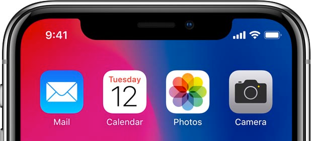
After the iPhone X launch event there is a lot of discussion about its distinctive “notch” at the top of the screen, which is housing the cameras and sensors that enable Face ID. Many people, especially designers, are voicing their opinions that it is ugly and it’s something that is not up to Apple’s design standards. The icons and time display crammed into corners just look bad.
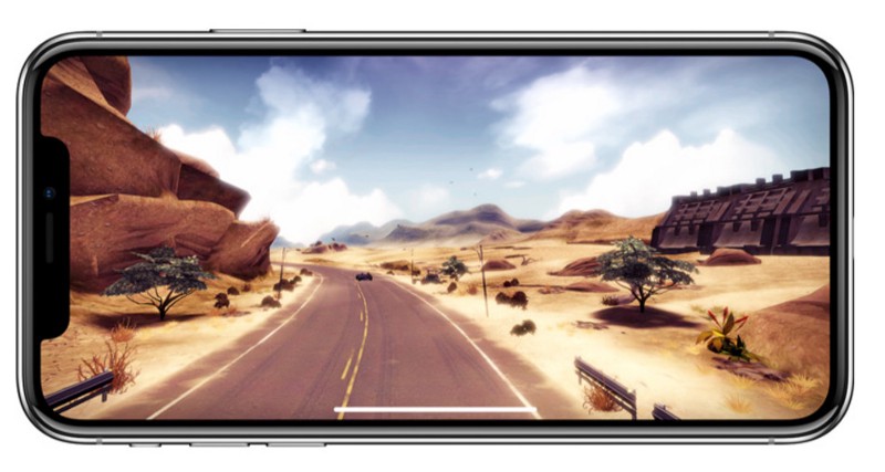
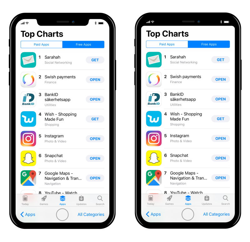
The notch is also problematic from the UX perspective: it is jarring when viewing full-screen videos or playing games on iPhone X, and when viewing websites in a landscape mode there are white bars at the edges of the screen to accommodate for the notch.
iPhone X renders webpages with literal white bars on the sides pic.twitter.com/ztcWetrLPo
— Thomas Fuchs 🕹📺 (@thomasfuchs) September 13, 2017
However Apple is fully embracing the notch. In their new HIG for iPhone X they tell developers specifically not to hide it with a black bar underneath:
Don’t mask or call special attention to key display features. Don’t attempt to hide the device’s rounded corners, sensor housing, or indicator for accessing the Home screen by placing black bars at the top and bottom of the screen. Don’t use visual adornments like brackets, bezels, shapes, or instructional text to call special attention to these areas either.
Before the keynote Max Rudberg speculated how Apple may change their UI to accommodate for the notch, either by hiding it or embracing it. It would be easy to hide it, but Apple clearly choose otherwise.
iPhone X mockups by Max Rudberg
(Also please note the virtual Home button on Max’s mockups, the most characteristic feature of the iPhone for many years, which Apple decided to remove entirely from iPhone X.)
So why did Apple do it?
Of course Apple designers are not incompetent. They consciously decided to draw attention to the notch on iPhone X — it’s a feature, not a bug. And I think most people are missing the point.
The notch is all about branding. It is there to make iPhone X easy to distinguish among other phones. To draw more attention to iPhone X amazing edge to edge screen and cameras. To make it different from many Android phones. And to replace the circular home button as a characteristic feature of the iPhone.
If there was no notch how could you draw the iPhone X? It would be just a rectangle with rounded corners — it could be any phone.
Now just look at Apple’s website menu. See that icon?

The notch is a design decision and a statement, just like iPod’s white headphones. Sure, it’s a compromise and it has it downsides, but it was clearly important for Apple to make it like this. And I feel there is an interesting lesson for all designers somewhere in it…
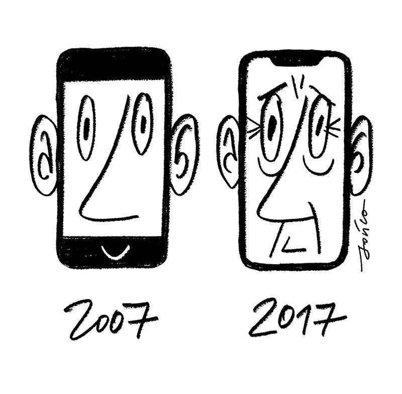
A drawing by the amazing Polish artist Paweł Jońca
This article was originally published at The Startup on Medium.
No comments.