Jako projektanci UX zawsze dążymy do tego, żeby nasze produkty były jak najprostsze w użyciu. Ale co to znaczy proste? To nie jest wcale takie proste 🙂
Making something simple is difficult. Simplicity is actually quite complex.
Niedawno ukazała się książka "Creativity, Inc.: Overcoming the Unseen Forces That Stand in the Way of True Inspiration" Eda Catmulla, współzałożyciela studia filmowego Pixar. To częściowo autobiografia, historia Pixara, a przede wszystkim świetna książka o zarządzaniu zespołem kreatywnym, napisana przez człowieka, który niespodziewanie został managerem, próbował czytać popularne podręczniki zarządzania, ale wydawały mu się one pełne buszlitu, wreszcie miał okazję uczyć się (nie bez bólu) od samego Steve'a Jobsa.
Przeczytałem niedawno bardzo fajną książkę, którą chcę Wam polecić: "Brick by Brick: How LEGO Rewrote the Rules of Innovation and Conquered the Global Toy Industry" Davida Robertsona. To historia znanej wszystkim firmy LEGO - od początków, przez kryzys w 2004 roku, kiedy firma stanęła na krawędzi bankructwa, aż do szczęśliwego przezwyciężenia problemów. Co mają klocki LEGO do UXa? Jak się okazuje sporo: jest to bardzo ciekawa opowieść o zarządzaniu innowacją, rozwoju produktów i nowych możliwościach jakie daje otwarcie się firmy na współprojektowanie razem z użytkownikami.
Kilka lat temu z inicjatywy Jana Jursy powstał projekt "UX Storytellers" - książki zbierającej doświadczenia projektantów UX ze świata. W ubiegłym roku Aga Szóstek, razem z innymi osobami z CHI Polska, postanowiła zrealizować podobny projekt w naszym kraju. W wyniku internetowego głosowania została stworzona lista ludzi, którzy zostali wytypowani przez polską społeczność UX do opowiedzenia swoich zawodowych historii w polskiej edycji "UX Storytellers". Znalazłem się w tym doborowym towarzystwie najbardziej doświadczonych specjalistów UX w Polsce (choć to lista na pewno nie kompletna!), obok takich osób jak Aga Szóstek, Tomek Karwatka, Marek Kasperski, Marcin Treder, Marcin Malicki, Krzysztof Piwowar, Piotr Szczepański, Bartek Mozyrko, Tomek Skórski, i inni. No i teraz polskie "UX Storytellers" jest tutaj - mam nadzieję, że nasze historie będą dla Was ciekawe i w jakiś sposób inspirujące 🙂
Bardzo często jestem pytany o to, jakie książki związane z UX mogę polecić. Więc oto i jest: moja lista. Cześć pozycji pewnie pominąłem przez zapomnienie, część pominąłem celowo, pewnie warto by było tę listę, co jakiś czas odświeżać, co postaram się robić. (Zawsze też możesz mnie śledzić w serwisie Goodreads.)
Z książki "Design Is A Job" Mike'a Monteiro, którą wszyscy designerzy (projektanci UX, projektanci graficzni) powinny zakupić i przeczytać!:
Who owns layout? Solving this problem once and for all
Every day, all across the world, probably as you read this, there’s a designer presenting page schematics, or wireframes, to a client. A page schematic is a terribly confusing thing to be showing to someone who’s not trained to read them. Even for someone who runs a website. (Ever look at the electrical wiring diagram for a refrigerator? Yet you stick your arm in one multiple times a day.)
And as if showing them that very confusing document isn’t enough pain to begin with we also throw in the biggest lie we tell our clients every day:
“These don’t imply layout.”
Oh, for fuck’s sake. How could they not?
This is generally done as a way to leave enough leeway for the visual designer to then come in and have the freedom to move things around as they organize the space and begin creating a visual experience. Which, by the way, we love. I once worked with an information designer who yelled at me for “moving things around!” (She’s no longer with us. The industry, I mean. Nothing was ever proven.) But we’re passing the problem on to our clients. We simply can’t tell a client to ignore the most obvious thing in front of them: an organized box! And think of all the meeting time we’d save by not having to constantly repeat that stupid phrase.
For years we’d go back and forth on ideas to make the river run uphill, and, well, the metaphor just gave it away. Let layout be layout. Get the visual designer and the information designer working together from the start. Get them to agree on a basic grid, a potential layout, core functionality placement, etc. And have everyone evolve that idea as the project moves forward so that every party is aware of what’s going on.
That way when you’re putting something in front of a client you can say something more to the tune of “This is where we’re headed with the layout, which we’re evolving together.”
So who owns layout? You all do. Now can we please stop arguing about it? It’s exhausting.
I jeszcze jeden cytat: I hate the term "information architect"; it’s a shame phrase, like "graphic novels". Designers are designers.
Takie podejście do projektowania wydaje mi się bardzo cenne, pozbawione bulszitu, atrakcyjne:
Over the last decade, designers have been encouraged to think big, to solve “wicked problems,” to use “design thinking” to tackle massive, systemic issues in business and in government. No problem is too large to not apply the tools of design to, and design engagements can involve everything from organizational restructuring to urban planning.
The results of this refocusing of design efforts are unclear. But by working at such a macro scale, an important part of design is often lost: the details that delight. Products that we love show an attention to detail: the beautiful curve, the satisfying click, the understandable mental model.
This is another way to work: not through grand, top-down design projects, but from the bottom up, by crafting—lovingly, with care—small things. This is something designers can do quite well, with immediate, tangible results. This is another way to change the world: by making seemingly inconsequential moments into instances of pleasure.
There is a joy in tiny things that are beautiful and work well. This joy is both on the part of the user and in the creator, even though it certainly takes skill, time, and thought to make it so. It’s hard work, and as admirable in its own way as tackling the Big Problems. After all, who doesn’t need more joy in their life?
Jest jeden problem, którego projektant interakcji, przy tworzeniu serwisów internetowych dla dużych firm, rozwiązać często do końca nie może: zaprezentowanie oferty w sposób zrozumiały i łatwy w nawigacji dla konsumenta. Niby to kluczowe, tego właśnie się od niego oczekuje. Ale bywa, że oferta firmy jest tak duża i złożona, że pokazać się jej prosto po prostu się nie da... bez uproszczenia samej oferty. Czasem oferty nie rozumieją nawet pracownicy firmy, co więc mówić o klientach.
Myślę tu o firmach takich jak telekomy z dziesiątkami taryf i ich wariantów, bankach z portfolio 200+ produktów finansowych, firmach ubezpieczeniowych, które mają kilkaset ubezpieczeń na każdą okazje, producentach komputerów z 60 modelami podobnych laptopów, itp.
Po co w ogóle pokazywać to całe dobro w internecie skoro nikt nie jest w stanie tego zrozumieć, porównać i świadomie wybrać, bez poświęcenia na to duuużej ilości czasu i energii? Paradox of choice zabija pewnie połowę potencjalnej sprzedaży. Czy bank naprawdę potrzebuje 11 rodzajów kont o niewiele mówiących nazwach i 8 kart kredytowych? Czy nie prościej oferować jedno konto i jedną kartę z dodatkowymi opcjami? Czy chce mi się wybierać spośród 10 ubezpieczeń medycznych (każde z dodatkowymi wariantami)?
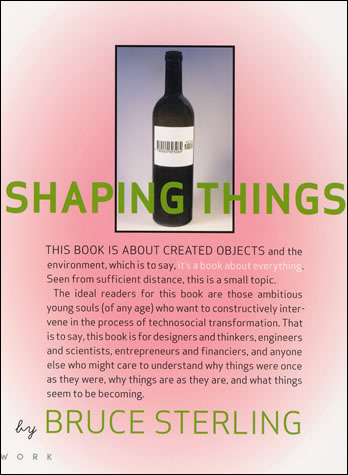
Przeczytałem ostatnio ciekawą książkę Bruce'a Sterlinga: "Shaping Things". To już dość stara pozycja (2005), ale nadal inspirująca. Sterling znany jest jako autor cyberpunkowej prozy SF, ale ta bardzo ładnie wydana książeczka to coś innego - krótki esej na temat przyszłości designu.
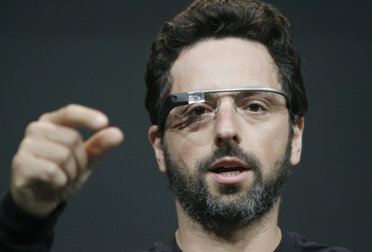
(…) dotknął jej twarzy. Nieoczekiwana twardość wszczepionych szkieł.
— Nie rób tego — powiedziała. — Zostają odciski palców.
Molly w "Neuromancerze" (1984) Williama Gibsona ma cybernetyczne szkła wszczepione w czaszkę i podłączone do nerwu wzrokowego. Jesteśmy teraz bliżej, niż kiedykolwiek cyberpunkowego świata. Google Glass, to pierwszy poważny komercyjny produkt (chyba będzie?), który nas do tego zbliża. Noszone na głowie ustrojstwo stale podłączone do internetu, które rozszerza rzeczywistość użytkownika o dodatkowe informacje pojawiające się bezpośrednio w polu widzenia. Sergey Brin, CEO Google, nie pokazuje się już publicznie bez tego urządzenia na twarzy.